
Hustle Design System
Since Hustle’s founding in 2014, the messaging platform had not used a consistent design system or component library. We’re changing that.
BACKGROUND
Multiple Sources of Truth
Over the years, Hustle’s UI had been designed, built, and implemented on a more-or-less ad-hoc basis. This has led to visual and interaction inconsistencies across the platform, with many components having multiple versions. It has created costly inefficiencies for engineers and designers, and an obvious inconsistent experiences for users.
To tackle this problem, I paired with an engineer to create and implement a new Hustle design system. Our goal was to consolidate and refine existing UI elements, create supporting documentation, and streamline new feature builds across the Hustle platform.
Due to how Hustle had been engineered, components would need to be implemented manually across the platform. This meant new and old designs would live together for an undetermined amount of time, so new designs should not clash with existing.
Because of the manual implementation process, this is an ongoing project.
Role
UX designer
UI designer
Interaction designer
Visual designer
Deliverables
Design tokens
Component library
Interactive components
Design guide
RESEARCH
Evaluating Legacy Designs
To get a fuller understanding of all existing components, I did a high-level audit of designs in production. Between live designs and an inconsistently-used component library in Storybook, I determined which components to keep and which could be retired.
This process helped uncover where inconsistent component designs existed, as well as give us a rough understanding of the scope of the project.

Some components, like dropdowns and menus, had multiple versions across the platform.
DESIGNS
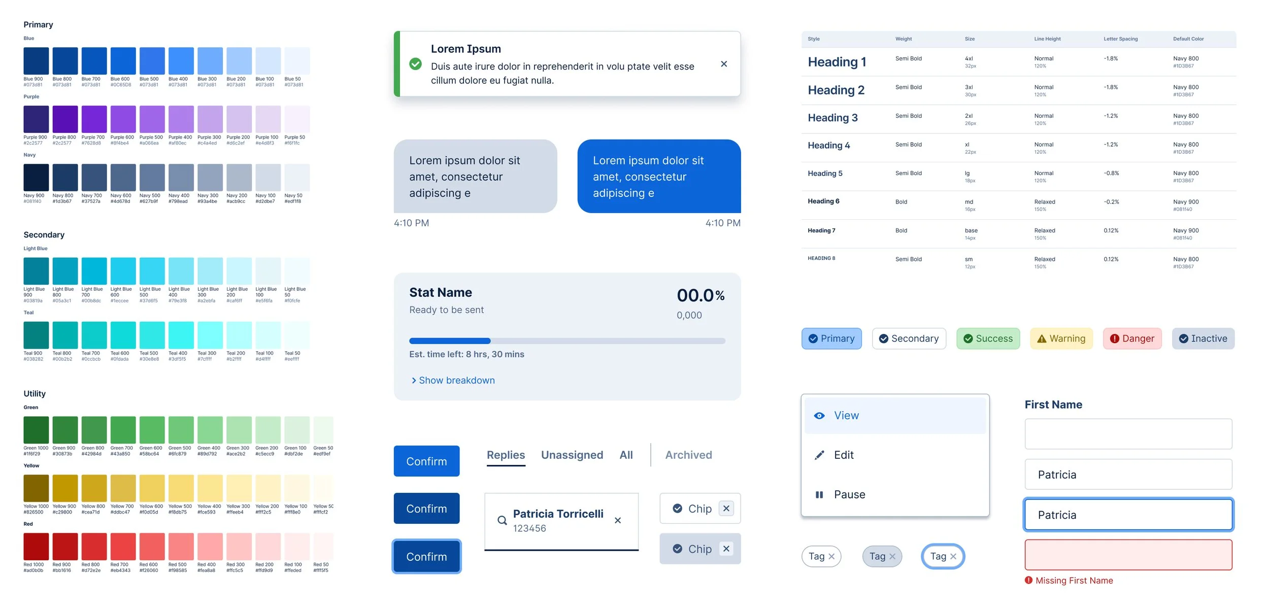
Tokens
I started the design phase by defining new design tokens—color, spacing, font sizes, etc. Since this project was a UI refinement and not a complete redesign, the new tokens mostly systematized current specs with some tweaks.
Two sizable changes we were able to make was to colors and fonts. For licensing reasons, we replaced the existing Halyard font family with the more modern Inter. While mostly for licensing reasons, this relatively modest CSS change helped give the product a nice visual refresh.
I also took the opportunity to introduce more brand colors to the product palette. Hustle had recently undergone a brand refresh that wasn’t yet reflected in the product.

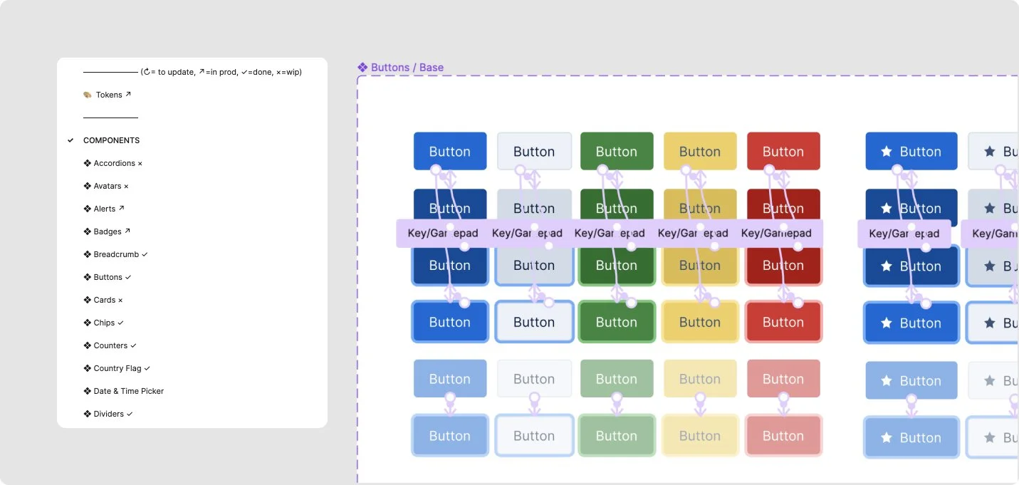
Interactive Components
Once tokens were solidified, I began building our final components using Figma features like auto layout and property variants for maximum flexibility. To expedite future prototypes, I also built in base interactions like hover, focus, pressed, etc. This has made designing new products and features much more efficient.
MAINTENANCE
Ongoing Execution
To keep track of progress for this ongoing project, we created a dedicated project in Linear. Any additions, edits, or corrections to the design system is recorded as a ticket, which has ensured accurate scoping and workload management. As new projects have revealed additional component needs, we’re able to maintain accurate parity between Figma designs and code with this process.
An interactive usage guide is also in the works.
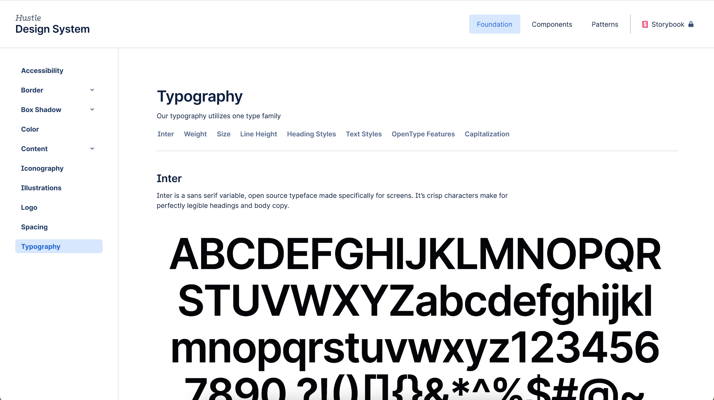
In progress usage guide.